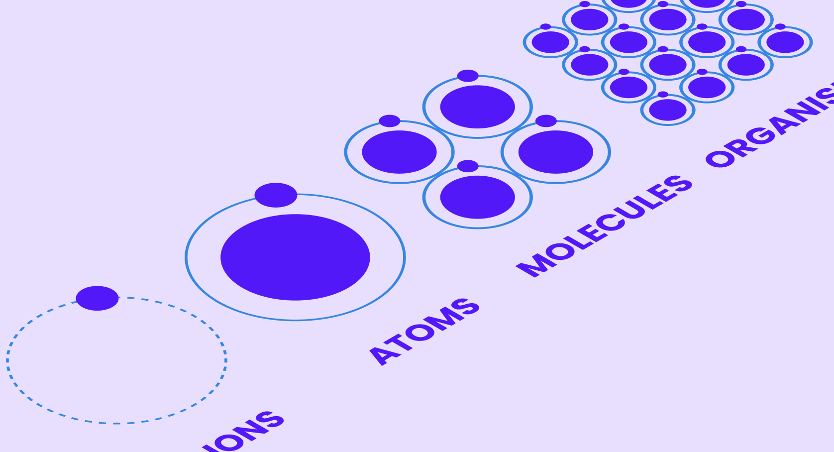
Introduction
So, everyone’s buzzing about tokens and you’re ready to join the party.
Well, the topic might seem a bit confusing until you cross over to “this side of the fence” and things start to click.
First off, know that Design Tokens have been around for quite a while. However, they used to be a sweet treat that only developers could savor.
Designers would deliver a document (usually a JSON or XML) detailing all the property selections like colors, fonts, dimensions, etc., present in their interfaces. Developers would then transform these styles into CSS, SASS, SWIFT, and so on, and use them in their implementations.
But why do I need them?
Well, to:
- Streamline communication between designers and developers.
- Ensure a “single source of truth” that consolidates all design decisions.
- Systematize design processes, eliminate redundancies, facilitate reuse, and promote consistency.
What exactly are Design Tokens?
It’s a name, a nickname. For instance, instead of referring to a color by its hexadecimal value (#FF3333), I can simply call it $happy-color.50.
Ok, I get it. So Design Tokens are like nicknames we give to design properties. For example:
- #FF3333 > $happy-color-50
- Poppins > $font-family-1
- DM Sans > $font-family-2
- 16px > $dimension-5
Well, don’t worry if this just seems more confusing. I promise it’s going to get much more clear and interesting later on when we start reusing each of these tokens.
For instance, $dimension.5 can be used to create a margin or a border-radius. Yes, because once the primitive tokens are established, we can create dependent tokens that reference these primitives. More on this coming up…
The 3 Tiers
There are three categories, levels, or tiers of Design Tokens:
Primitive Tokens
Also referred to as:
- Base Tokens
- Global Tokens
- Core Tokens
- Basic Tokens
- Choice Tokens
- Option Tokens
- Palette Tokens
They are the simplest level of tokens: 1 name > 1 property.
Building structure:
- RAW VALUE > PRIMITIVE TOKEN
Examples of Primitive Tokens:
- #FF3333 > $happy-color-50
- Poppins > $font-family-1
- DM Sans > $font-family-2
- 16px > $dimension-5
System Tokens
Also referred to as:
- Alias Tokens
- Common Tokens
- Application Tokens
- Semantic Tokens
- Purpose Tokens
- Decision Tokens
- Applied Tokens
Here things take a different turn. System tokens describe roles and responsibilities. For example:
- The brand’s main colour
- The font-family for titles
- The average font size
- The large border-radius size
System Tokens have a unique rule:
- They never mask a RAW value. System Tokens must ALWAYS refer to another token, of equal or lower tier, i.e. Primitive or System Token.
Let’s see, if I want to say that my primary brand color is #FF3333, I will establish that the System Token $brand-primary references the Primitive Token $happy-color-50.
If I want the font used in all titles to be Poppins, I will establish that $titles-font references $font-family-1.
If $font-family-1 changes from Poppins to Comic Sans, the change will also be reflected in $titles-font.
Building structure:
- PRIMITIVE TOKEN > SYSTEM TOKEN
- SYSTEM TOKEN > SYSTEM TOKEN
Examples of System Tokens:
- $dimension-10 > $border-radius-sm
- $happy-color-50 > $primary-color-50
- $font-family-10 > $font-family-titles
Component Tokens
Also referred to as:
- Scoped
- Override
As the name implies, Component Tokens are created for components’ properties.
- $button–primary–bg-color
- $button–secondary–bg-color
- $button–shadow
- $button–padding
Building structure:
- COMPONENT TOKEN > SYSTEM TOKEN
Examples of Component Tokens:
- $button–border-radius > $border-radius-sm
- $text-field–bg-color > $global–bg-color
- $checkbox–border > $border-md
Component Tokens also have rules:
- They must reference System Tokens only.
- They can’t be referenced neither used by more than one component.
- In other words, each Component Token is applied to one and only one component.
This is where the power of Design Tokens is unleashed!
By setting up each component property as an individual Design Token, your future control over your Design and implementation is infinite.
Let’s see an example. Assume the next:
- Checkbox has the token $checkbox–border-radius
- Text-field has the token $text-field–border-radius
- Both reference the System Tokens $border-radius-sm
Problem 1
You feel that 1px is barely noticeable and you decided that your smallest border-radius should instead be 2px.
Solution 1
Great. Just do it at your System Tokens level. Change your $border-radius-sm from pointing at $dimension-1 to $dimension-2
Problem 2
You feel that $border-radius.sm is ok for the Checkbox but too small for the Text-field.
Solution 2
Great. Do it at the Component Token level and directly change $text-field–border-radius to reference, for example, $border-radius-md.

Leave a Reply